
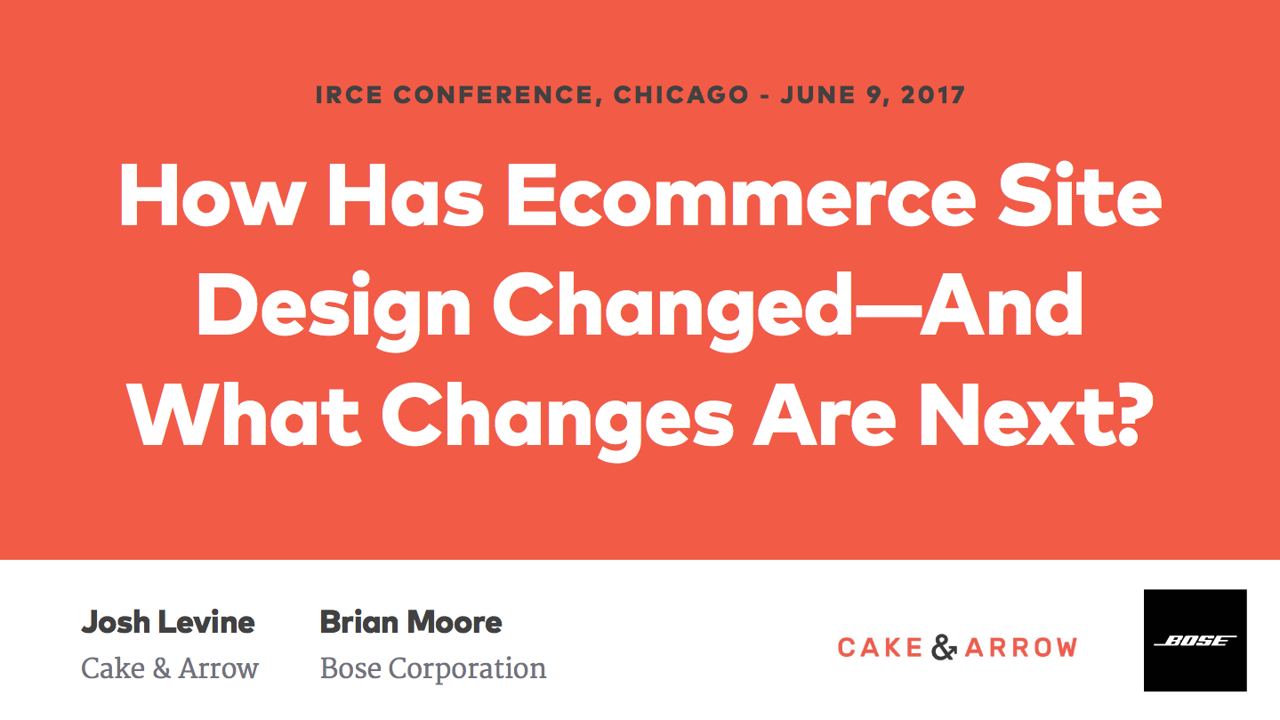
Last week, Josh Levine, Chief Design Officer at Cake & Arrow presented alongside Bose’s Brian More at the Internet Retailer Conference and Expo in Chicago. The two discussed the past and future of site design in ecommerce and retail, exploring how and why design trends have shifted through the lense of Bose’s own digital evolution.
The presentation was designed to help retailers understand how changes in design have followed a general trend toward customer-centricity that is only now being fully realized, as technological innovation and industry advancements have made more integrated customer-focused experiences possible.
You can watch and download deck to the full presentation here.
It’s all about the people
As brands demonstrate their capacity to deliver on customer experience, customer expectations continue to rise and the demand for more custom and integrated shopping experiences is greater than ever. Nowadays, the expectation is not only that brands deliver good design–this a is a given. They need to design experiences that speak to their customers on a personal, practical, and emotional level.
Josh explained how, in order to engage the modern shopper, brands need to deliver on certain expectations customers now share.
What people expect
1. More distinctive brand experiences
Now that design and user experience have converged, with the most usable designs winning out over the most beautiful, there are a handful of design components that brands must take advantage of in order to deliver distinctive brand experiences that differentiate them from their competitors. Colors, typography, layout, and what Josh refers to as “micro-interactions” that provide subtle but delightful experiences that humanize interactions are where brands should focus.
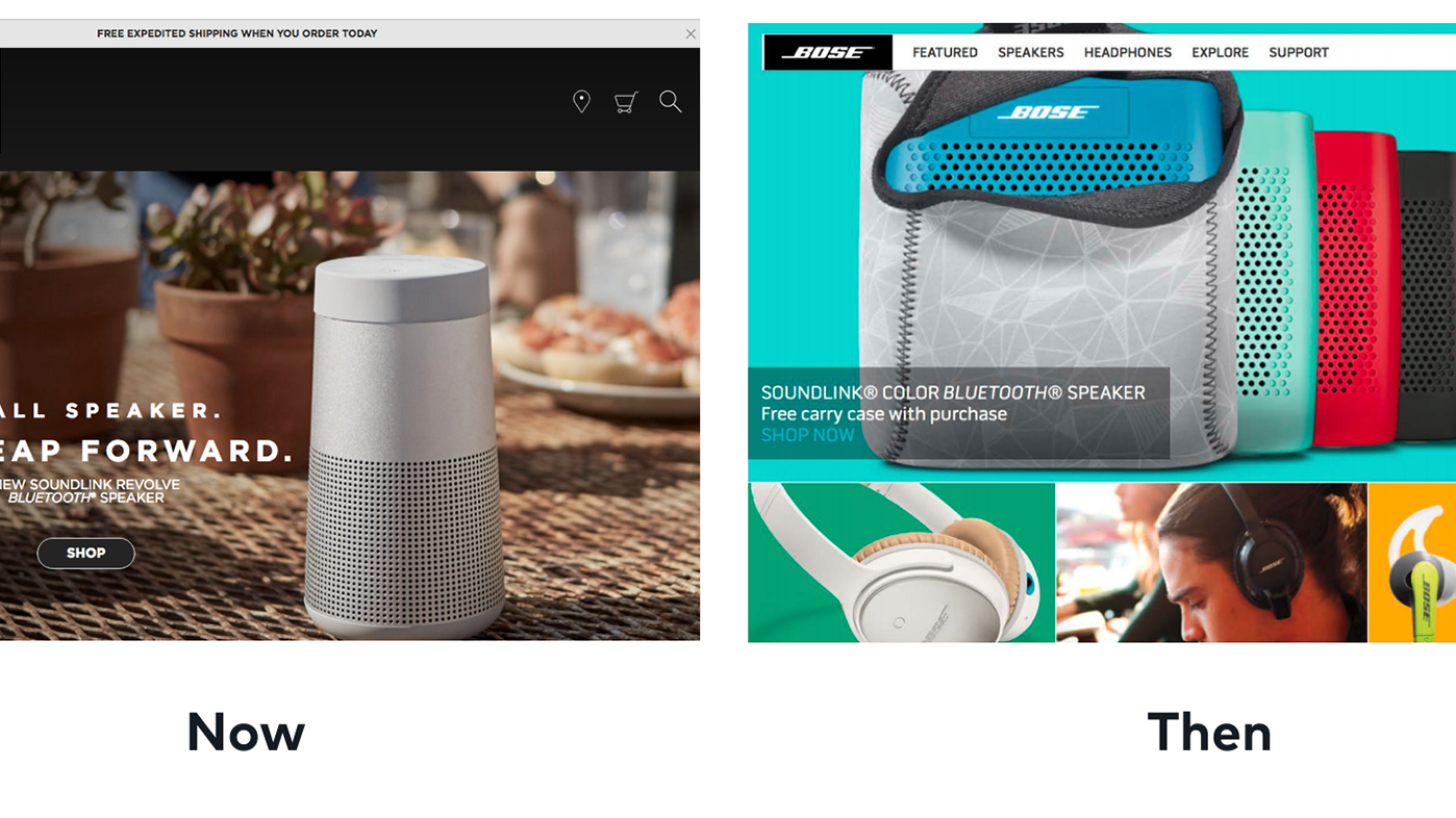
For Bose, this has manifested in a newfound focus on clarifying and defining what their brand is and is not, so they can do away with any aspects of design, digital or otherwise, that detract from this identity. In 2016, for example, they experimented with using an array of bold colors on their website and soon realized that this was not consistent with brand experiences elsewhere. In recent years, they have returned to a mostly black and white palette, one which reinforces the quality and simplicity of their product, and allows them to emphasize their attention to detail–a key differentiator for their brand–through photography, layout and typography, without the distraction of too much color.
As brands demonstrate their capacity to deliver on customer experience, customer expectations continue to rise and the demand for more custom and integrated shopping experiences is greater than ever. Nowadays, the expectation is not only that brands deliver good design–this a is a given. They need to design experiences that speak to their customers on a personal, practical, and emotional level.
2. Shopping experiences tailored to the products they are buying
When customers are shopping, they want to be told stories. In the same way that reading a novel is more engaging than reading a dictionary, telling stories about products will engage customers more than a product description will, and in the end, will tell them more about the product. This is the role of design.
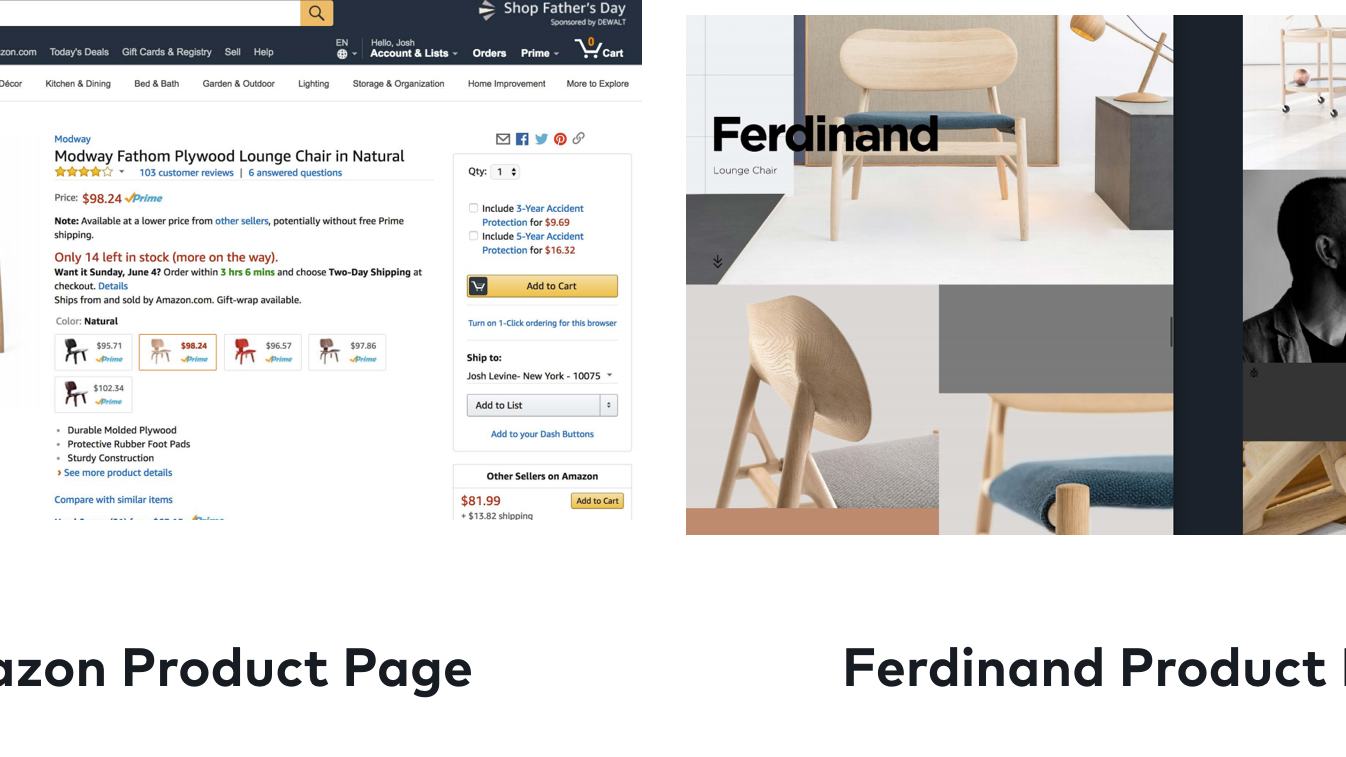
To illustrate this point, Josh compares the product page on Amazon for a lounge chair with the product page on the brand’s own website, showing how, through the use of photography, the brand is able to tell a story about how the chair might fit into the customer’s home, and more importantly, their daily life. There are many ways brands can tell these stories about their products, whether it’s through the use situational photography, creative product videos, or by crowdsourcing and integrating social media into the shopping experience.
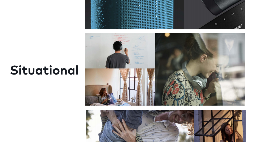
Bose uses different kinds of photography–studio, situational, and evocative–to tell a fuller story about what their products are about, and how they fit into their customers’ lives.
Studio photography is used to help customers gain a deeper sense of Bose’s immense attention to detail, which differentiates their products from other brands’. Situational photography is used to give customers a sense of how a product might fit into their lives. Rather than hiring models for these photos, they shoot actors, or regular people in natural environments to show how these products seamlessly integrate into daily activities in a believable way. Both of these types of photography are used alongside what they call evocative photography, or, photography that speaks to a particular emotion or feeling. Together, these three types of photography help Bose tell a multifaceted story that connects their products to their customer’s lives in emotional and practical ways.
3. To be met where they are at
Perhaps most importantly, to be effective, brands need to use design to meet people where they are at. Machine learning and data integration have given brands deep insights into their customers that they have never had access to before. Brands can now personalize content using these insights. For example, Yelp now sends push notifications letting their users know when a new restaurant opens in their area, and Netflix recommends certain movies based upon movies you have watched before. In the future, ecommerce stores will be expected to use similar tactics, making use of personal data to personalize experiences.
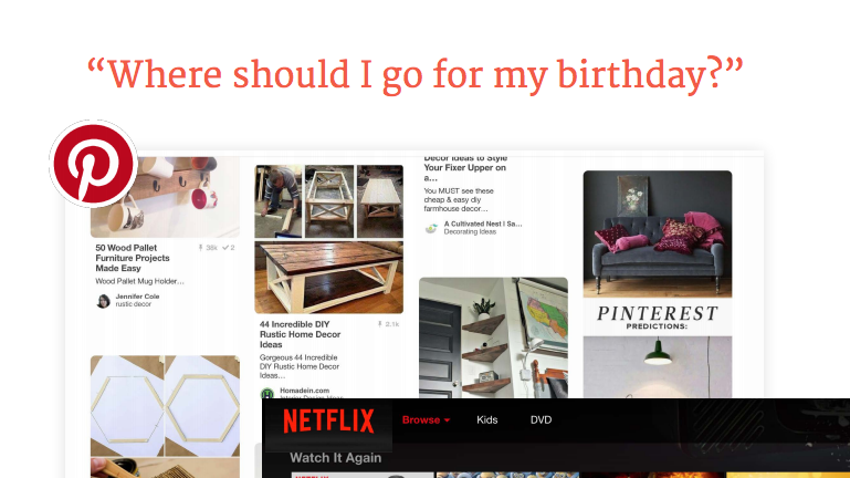
Bose does this by creating personalized product pages based upon user’s past interactions. Those who have visited their website through any of their NFL advertising, for example, may see a photo of a football player wearing a pair of headphones, which differs from the page organic visitors may see. The more brands can use the knowledge they have of their customers to tailor shopping experiences, the more effective their designs will be.
As technology continues to advance at the rapid pace we see today, so must a brand’s ideas of what design can do, and even what design can be. Voice automation, for example, accounts for 22% of mobile inquiries, and has now reached 95% accuracy, which begs the question: what will design look like when there are no longer screens to design for? For brands, thinking about design less as a visual arrangement of colors, and fonts, and photos, and more as a conversation they are having with a customer will help them keep pace with technology, and with what their customers will come to expect from them.
To watch the entire presentation, and download the presentation deck, click here.