Launching an essential product in an uncharted market
Ernst & Young (EY), a multinational professional services firm headquartered in London is one of the largest professional services firms in the world, counted among the “Big Four” accounting firms globally.
With the acquisition of technology assets and related patents, EY wanted to scale Crypto asset accounting tax services to a broad retail and institutional investor audience by creating a market-defining product for easily filing Crypto assets. While Cryptocurrency and Crypto investing has become widespread in recent years, the process of filing Crypto assets is not straightforward, and most major online tax filing tools don’t offer a simple way to do so—even as the IRS has begun cracking down on Crypto tax filing
EY brought Cake & Arrow in to help them establish an intuitive, market-leading digital experience to guide retail and institutional investors through the process of successfully reporting and filing their Crypto-asset taxes—consolidating data from the leading exchanges and guiding them through preparation of IRS tax returns.
Product Strategy
UI/UX Design
Visual Design
User Research
Prototyping
Customer Experience
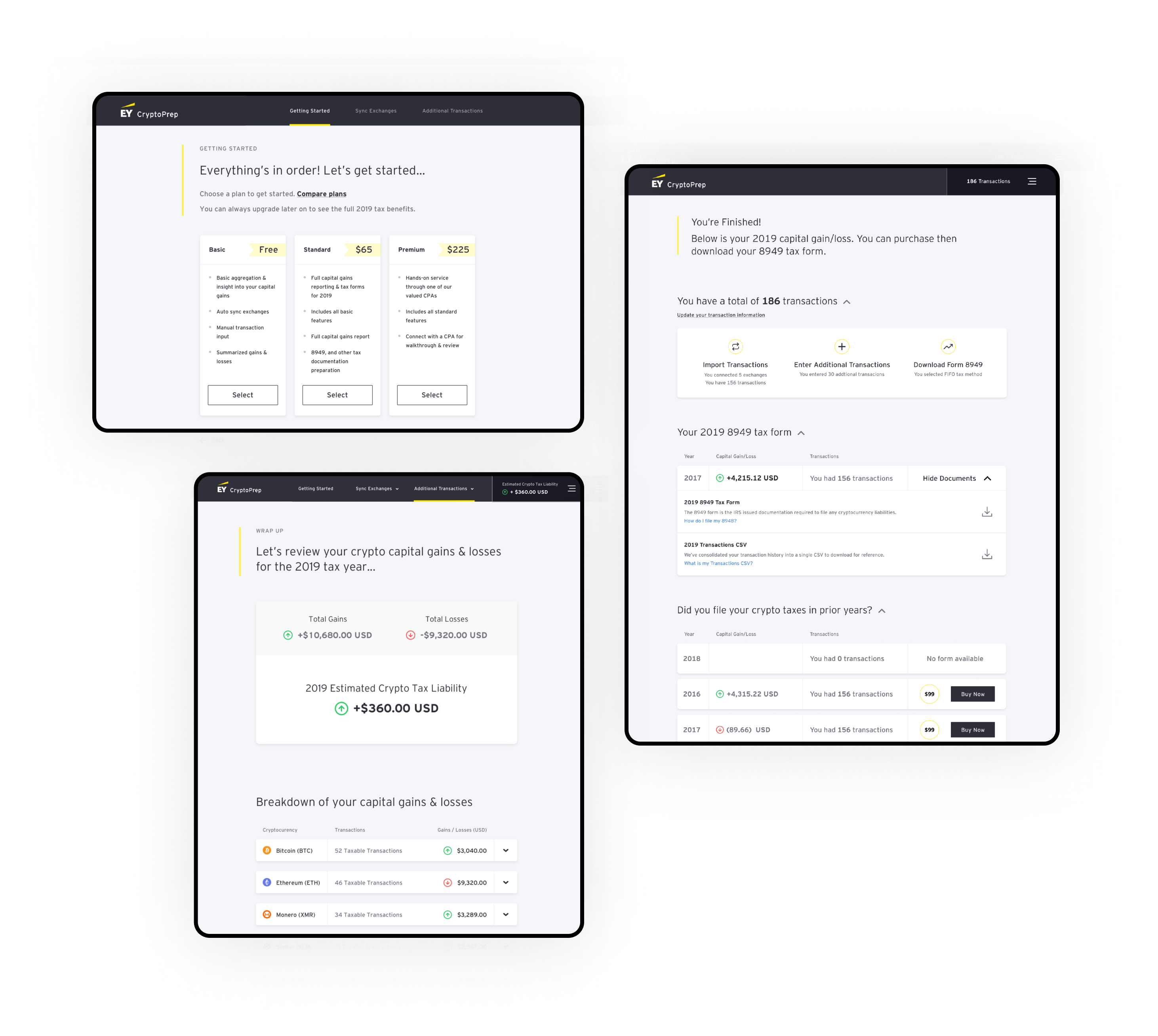
Balancing education with usability
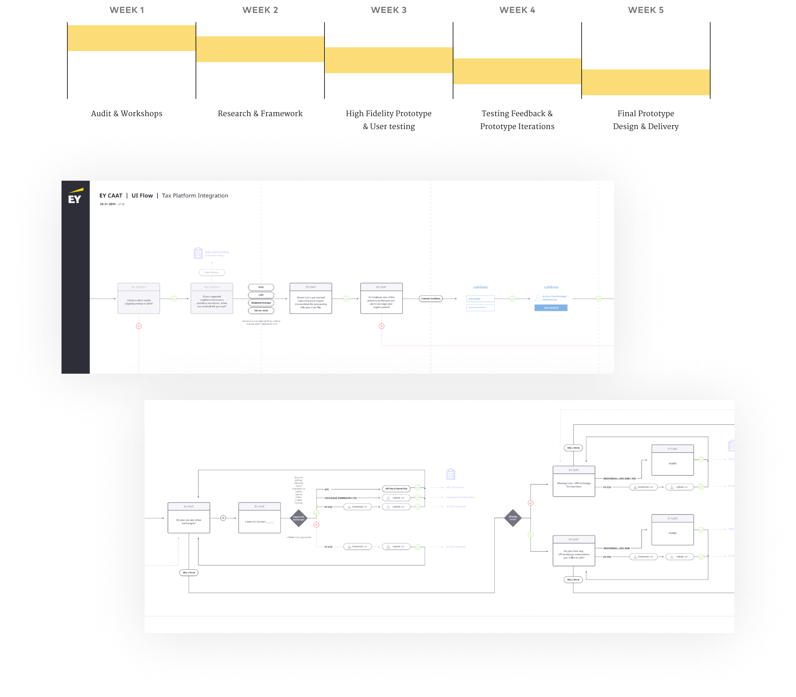
After conducting extensive background research, requirements documentation, and a series of collaborative workshops with EY’s SMEs to wrap our own heads around Crypto regulation and tax filing, we spec’d out a workflow and designed a clickable prototype that walked users through filing their Crypto assets. We used this prototype to test and validate the application with users.
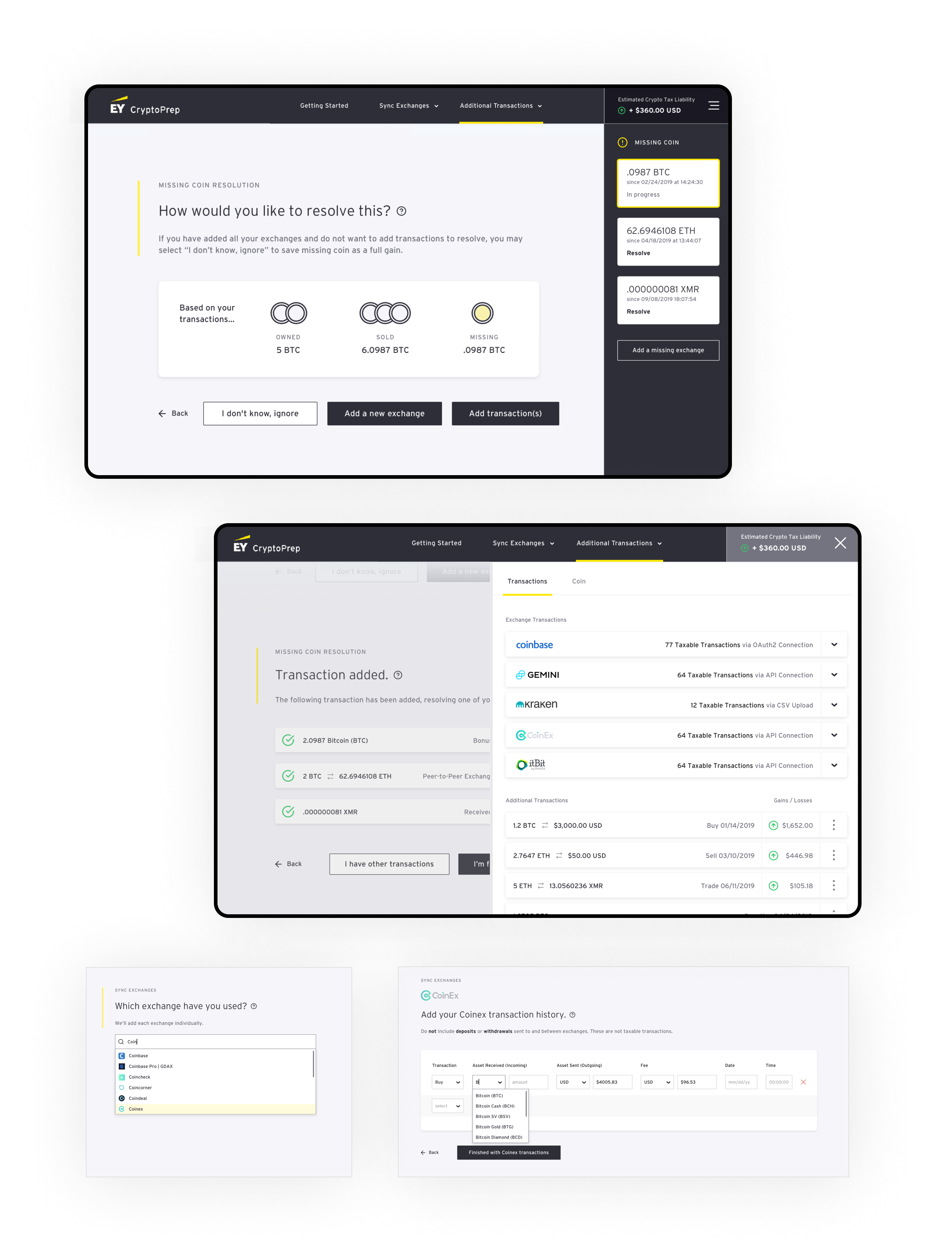
While the process of filing Crypto assets may be novel, digital tax filing is a process that has been streamlined and standardized in recent years, providing a workflow familiar to users that could serve as the starting point for our design Still, because filing Crypto assets was a new concept to users, the process required that education, not necessary in standard filings, be embedded into the filing process. Our challenge was to provide users with enough education to understand what and why they needed to take certain steps, without hindering the usability of the application. Through multiple user testing sessions, where we had users click through our prototype design, we were able to identify challenges and roadblocks to usability alongside gaps in education to refine the workflow.
Nailing the Basics
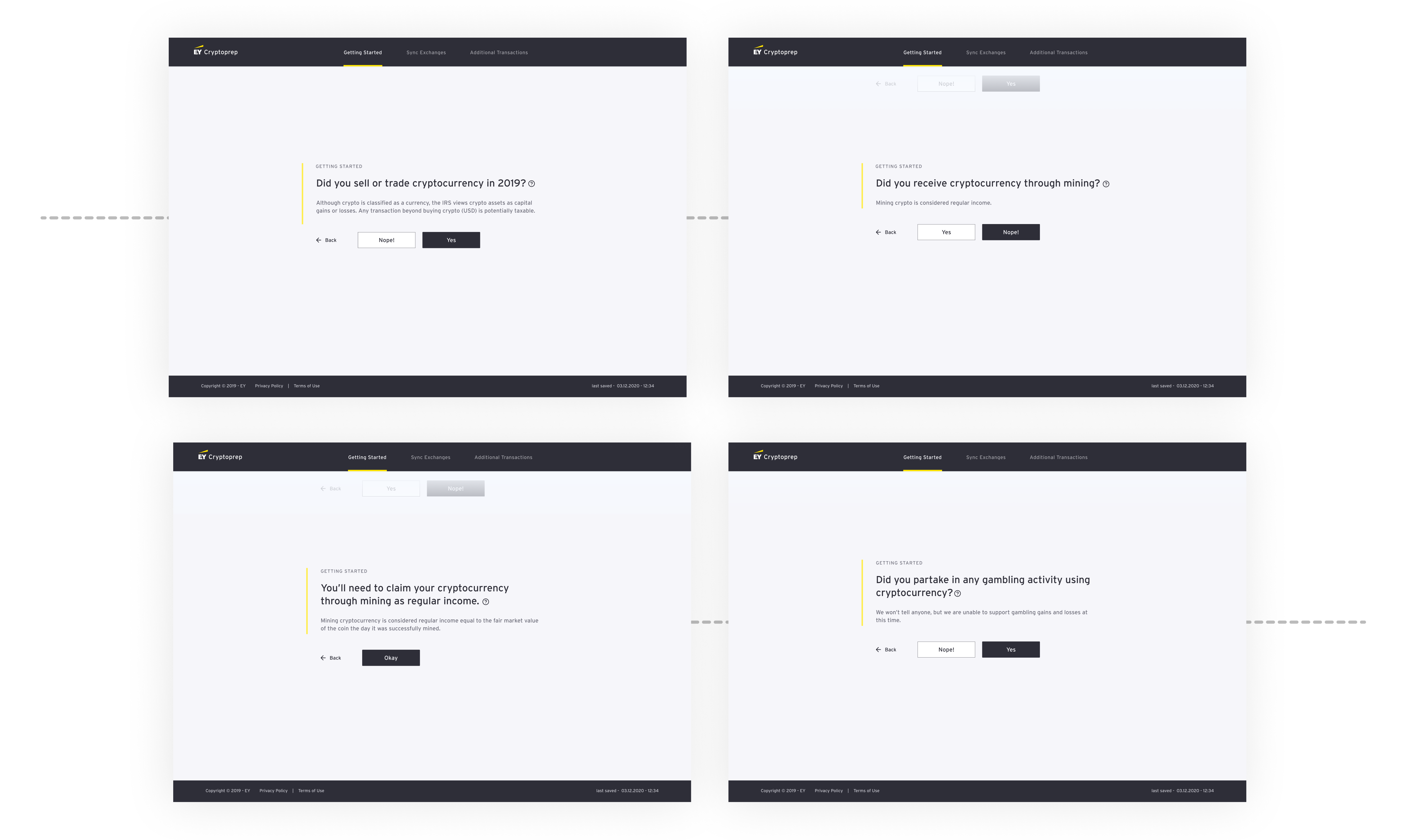
Because many users were confused as to the basic question of whether or not they even needed to use the app to file Crypto assets, our design included step-by-step instructions for quickly qualifying user eligibility up front along with information about the current tax requirements and implications. We also incorporated notes throughout the experience to help users understand what is taxable and when we need more information.
Designing for diverse expertise
Spelling out everything—from how to upload a CSV to indicating where users are in the workflow—is crucial to creating a seamless experience that users trust.

