Recently, we had an opportunity to take TryMyUI.com for a spin. We conducted 24 remote usability tests for an upcoming whitepaper. During our testing, we discovered that TryMyUI is the perfect example of the type of tool we strive to build in our own work. It’s easy to use, solves a problem, and improves the lives of our researchers and clients.
As a UX designer, finding the right balance between rigor and agility is important. Our well-rounded user research approach—and the fast clip at which we are expected to produce good work—don’t naturally go hand in hand. That’s why it’s crucial to constantly iterate on our process.
In the past six months the UX group at Cake & Arrow has conducted over 18 research events. We use each of these events as an opportunity to refine and systematize our approach. The result is a testing toolkit consisting of templ ates, resources, and online tools. This toolkit allows us to be lean with our approach, and make the best use of our clients’ timelines and budgets.
Remote user research is one of the many tactics we’ve used to help us strike a good balance. It provides us a fast, inexpensive means of achieving valuable customer insights. It also cuts down on the time and resources usually required for in-person testing. To run these tests with success, it is critical that that we identify reliable tools that give us data we can trust.
We had a great experience with TryMyUI. Here are some of the things we liked best:
Bring Your Own Users
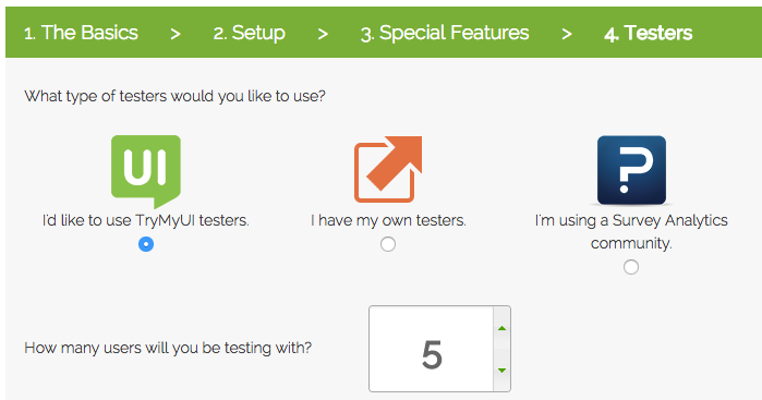
When working on projects for our clients, we often need to recruit users with experience in our client’s industry. When we do this, we typically end up partnering with recruiting firms to find specific, qualified candidates for each event. Whereas other remote platforms charge a premium for this capability, TryMyUI offers the option to bring your own users, or leverage theirs.
Ease of Use
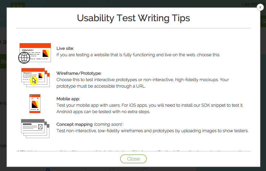
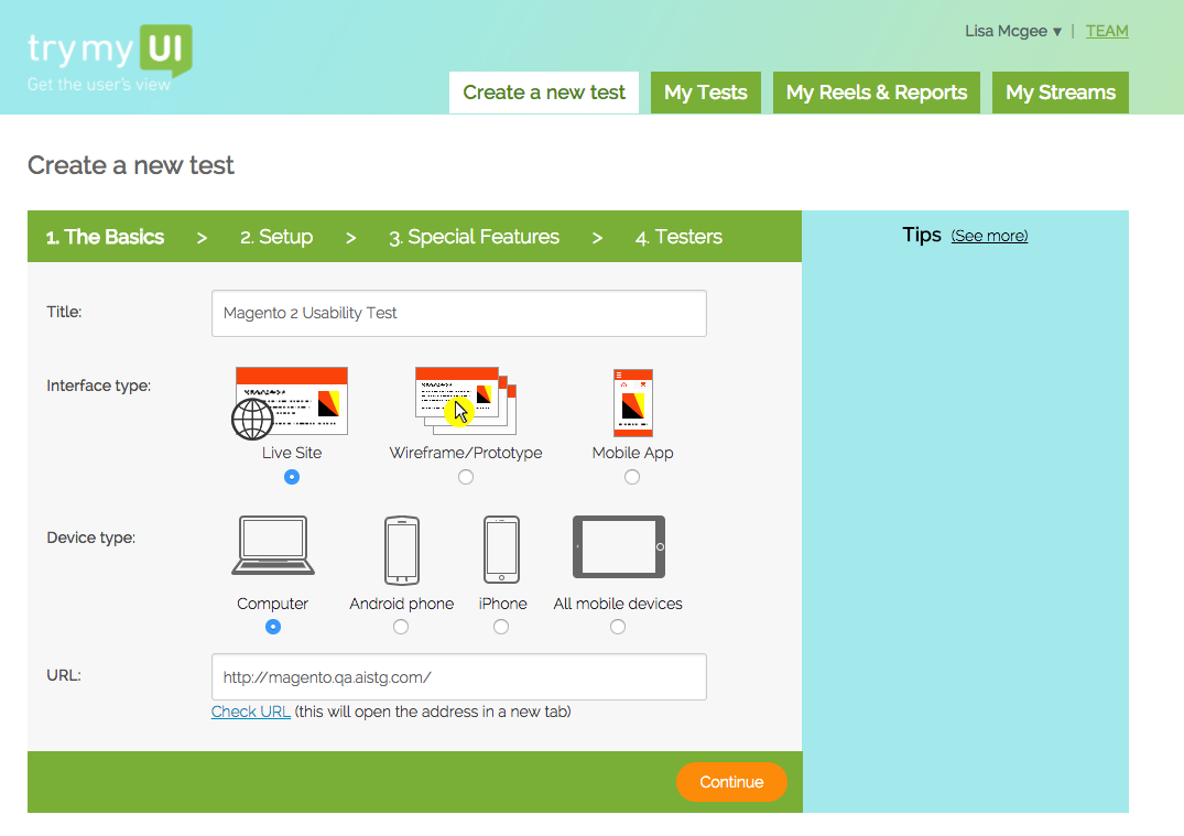
As with any good tool or website, ease of use is critical. We found that setting up the tests for our research was easy, requiring 4 simple steps that could be completed in a few minutes. The site offers a robust help guide that includes suggested questions and tasks.
Robust Quantitative Data
We love TryMyUI’s unique focus on quantitative data. During test setup customers can enable these options:
- System Usability Scale(SUS)—A post-test survey that rates the perceived usability of the UI.
- Single Ease Question (SEQ)—A single, post-task question to gauge the performance satisfaction of each task.
Although perceived usability does not always correlate to actual usability, users’ perception of their experiences matter. Perceived usability can help predict customer loyalty. It impacts the first impression customers have with digital products, and informs their decision to come back.
This quantitative data (alongside our qualitative findings) gives our researchers a solid benchmark to measure usability over time. As a numbers-focused agency, this data has proved useful when evaluating design decisions.
Quality Assurance
Finally, TryMyUI watches all recordings before passing them along to customers. This small detail surprised and delighted our team (something we try to do in every product we create for our clients). This level of quality assurance is rare from an online provider. While it did increase the turnaround time, the confidence we gained in our participants’ responses was invaluable.
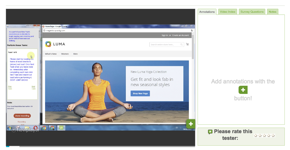
When evaluating design decisions, having access to lean, quality testing tools that help us conduct quality research quickly and with rigor is everything. TryMyUI’s ease of use, robust quantitative data, and flexibility have won it a definite spot in our toolkit. TryMyUI’s UI makes a case for itself: when you use user testing to create a great experience, people will want to use it.