Insurance is typically written in the finest print—dense, abstract concepts like risk, protection, and contingency plans that only come into play when life throws a curveball (or the whole kitchen sink). At Cake & Arrow, our challenge as human-centered researchers and designers is to make those ideas feel real and accessible to the people we’re designing for, whether they’re consumers, policyholders, brokers, or even internal employees. That’s where design research steps in, transforming that tiny, tedious text into something people can actually see, understand, and maybe even trust.
Design research isn’t just about gathering feedback; it’s about using empathy and insight to steer a better course. Through design research we try to truly understand the unspoken needs, frustrations, and hopes of the people who will use and benefit from the experiences we’re designing. By asking better questions, visualizing meaningful solutions, and co-creating with clients and users, we can bridge the gap between what insurance is and how people experience it. The result is a human-centered design process that builds products and services people genuinely want to engage with.
Here’s a look at how we’ve used design research to turn the intangibles of insurance into something more relatable and relevant.
Making the invisible visible: Asking the right research questions
Understanding how people interact with insurance requires more than surface-level surveys and cursory questions. We use design research frameworks such as journey maps, personas, and empathy maps to unearth deeper insights.
For example, with journey maps we consider every step different types of people might take, highlighting roadblocks or points of uncertainty. User profiles and personas give us a framework for understanding and articulating patterns and commonalities within our broader audience, while empathy maps help us imagine and capture the real thoughts, feelings, and frustrations that people experience along the way.
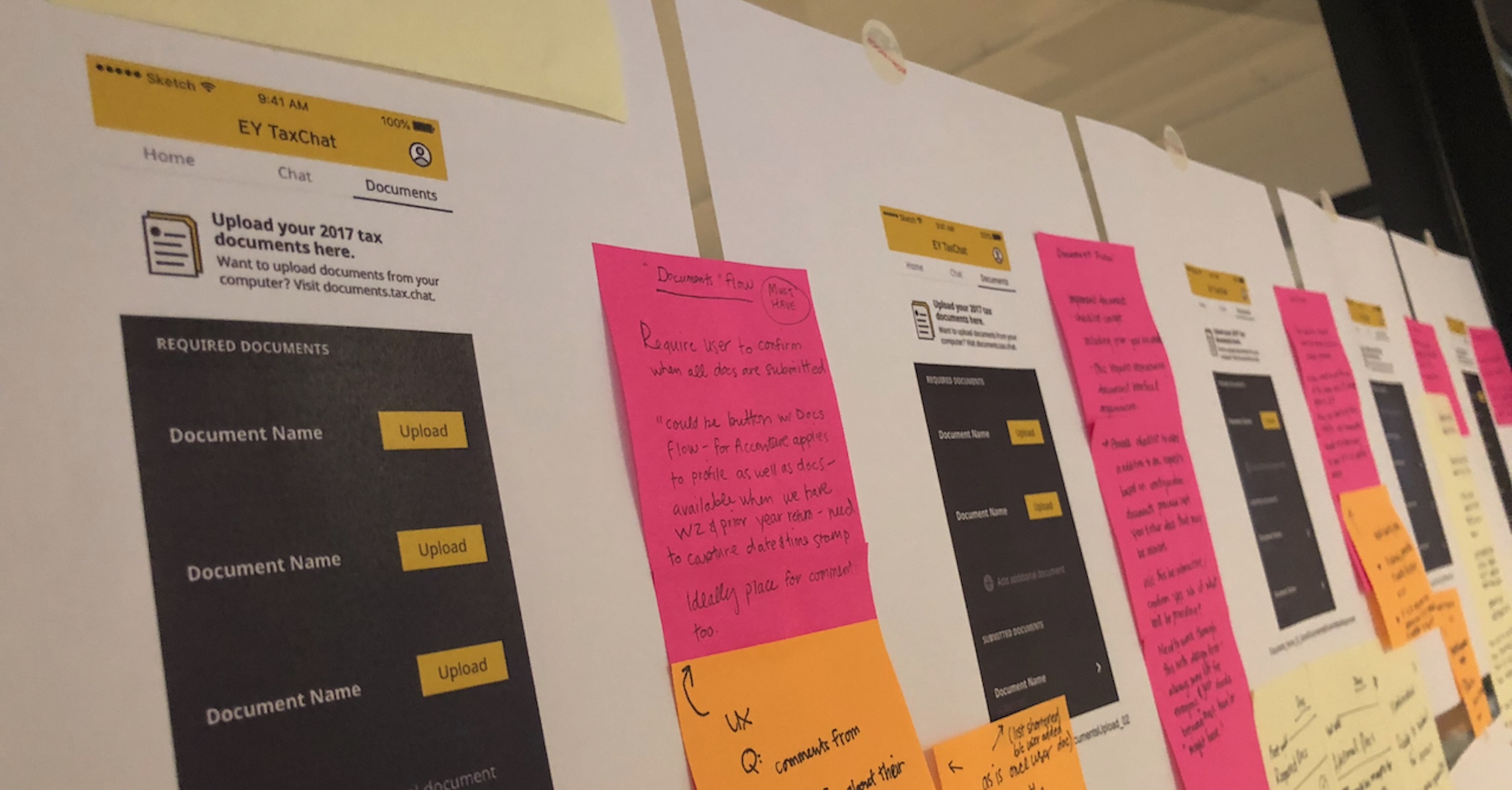
Early in the discovery phase, the C&A team uses these tools collaboratively with clients to surface what they already know (or think they know) about their customers and stakeholders. This highlights knowledge gaps to fill through direct user research and suggests baseline hypotheses to validate, test, and further develop. Following research, the team may update these visualizations to incorporate research findings and insights—concretely illustrating a way forward in the design work.
From a research perspective, this “Design Thinking” work helps us understand and internalize the human factors and realities of insurance. Then we can ask more specific questions to uncover where things break down and why. Instead of a general “what’s wrong with the claims process?” we can ask: Are customers giving up because they can’t tell if their roof is “asphalt” or “architectural” shingles? Waiting on a contractor’s estimate, they didn’t know they needed? Frustrated because they’re still in the dark about their payout?
The answers to these pointed questions are more specific and actionable, and help support better, faster decision-making.
Case study: Texas Mutual’s policyholder experience transformation
For Texas Mutual, a leading workers’ compensation provider, reimagining the policyholder experience started with understanding policyholders on a deeper level. Collaborating with stakeholders, we identified four unique policyholder archetypes, and mapped their journeys from initial awareness through policy renewal. This revealed key moments where policyholders faced barriers or confusion. Creating these journey maps helped us uncover opportunities to improve communication and support at each stage, laying the foundation for a more transparent, empathetic experience.
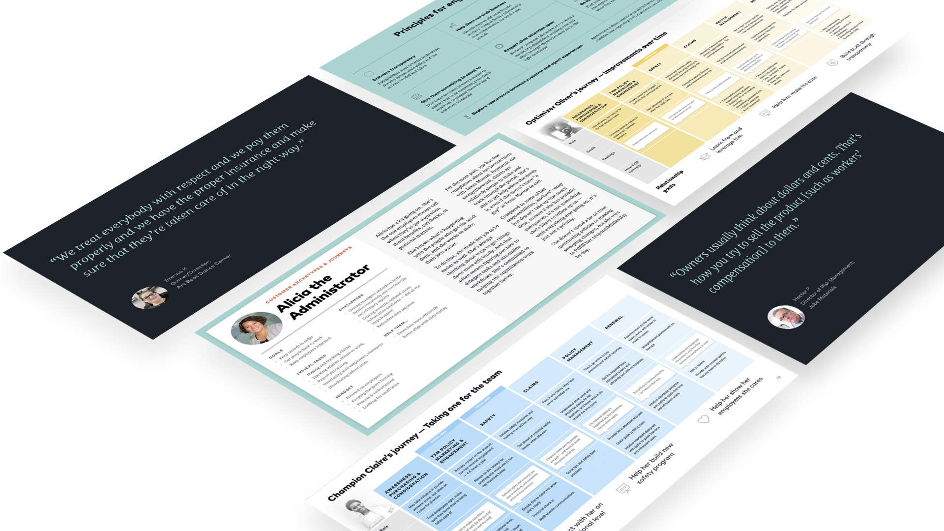
Personas and empathy maps deepened this understanding, showing us not just who these policyholders were, but the emotions, frustrations, and needs that shaped their interactions.
These artifacts suggest new areas of inquiry and lines of questioning rooted in actual concerns—like “What’s your biggest worry when it comes to renewal?” and “Who do you turn to for support?” They also help Texas Mutual keep policyholders present and top of mind as it adopts meaningful CX practices genuinely aligned with customers’ experiences.
Turning insights tangible: Imagining and testing realistic solutions
In design research, insights are just the start. Real value comes from translating those insights into actionable solution drivers. We first use “how might we” (HMW) questions to turn insights into open-ended challenges that inspire creativity without prescribing solutions.
For example, if we find that policyholders feel intimidated by the claims process, we might ask, “How might we help policyholders feel more confident when navigating claims?” This framing opens space to explore all kinds of ideas and eventually points to solutions that address the core need rather than assuming one answer. With HMW questions, abstract observations become productive prompts that spur testable concepts and can lead to impactful, user-centered solutions.
Case study: Innovating for the gig economy with a top P&C insurer
With gig work on the rise, A top P&C insurer wanted to better understand how to support this unique workforce—many of whom face risks that don’t quite fit traditional insurance models. Our qualitative research revealed that gig work often supplements primary income, with workers assuming some level of coverage but rarely prioritizing insurance.
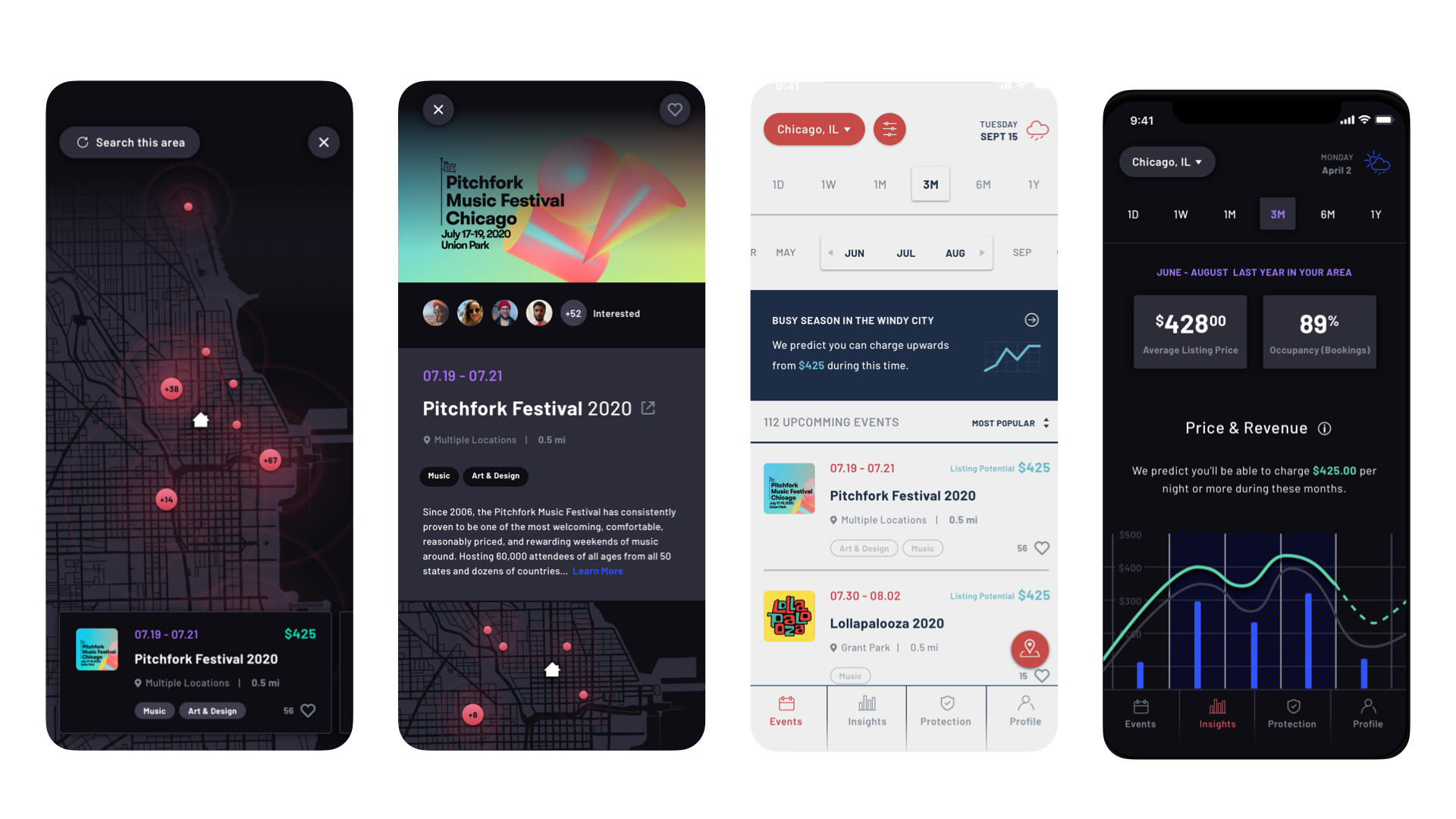
Using HMW questions, we crafted three “starter concepts” designed to address critical gaps and spark conversation with gig workers. These concepts weren’t about presenting finished solutions but about making ideas tangible enough to prompt meaningful feedback. Testing them with representative gig workers helped us understand what resonated, what missed the mark, and where the most meaningful opportunities lay.
Case study: Using “how might we” questions to unlock deeper solutions for JennyLife
When JennyLife, a life insurance provider for new mothers, wanted to explore beyond their core offerings, we asked, “What else might new parents need as they enter this life-changing phase?” This question evolved into, “How might we support new parents with care and authenticity?”
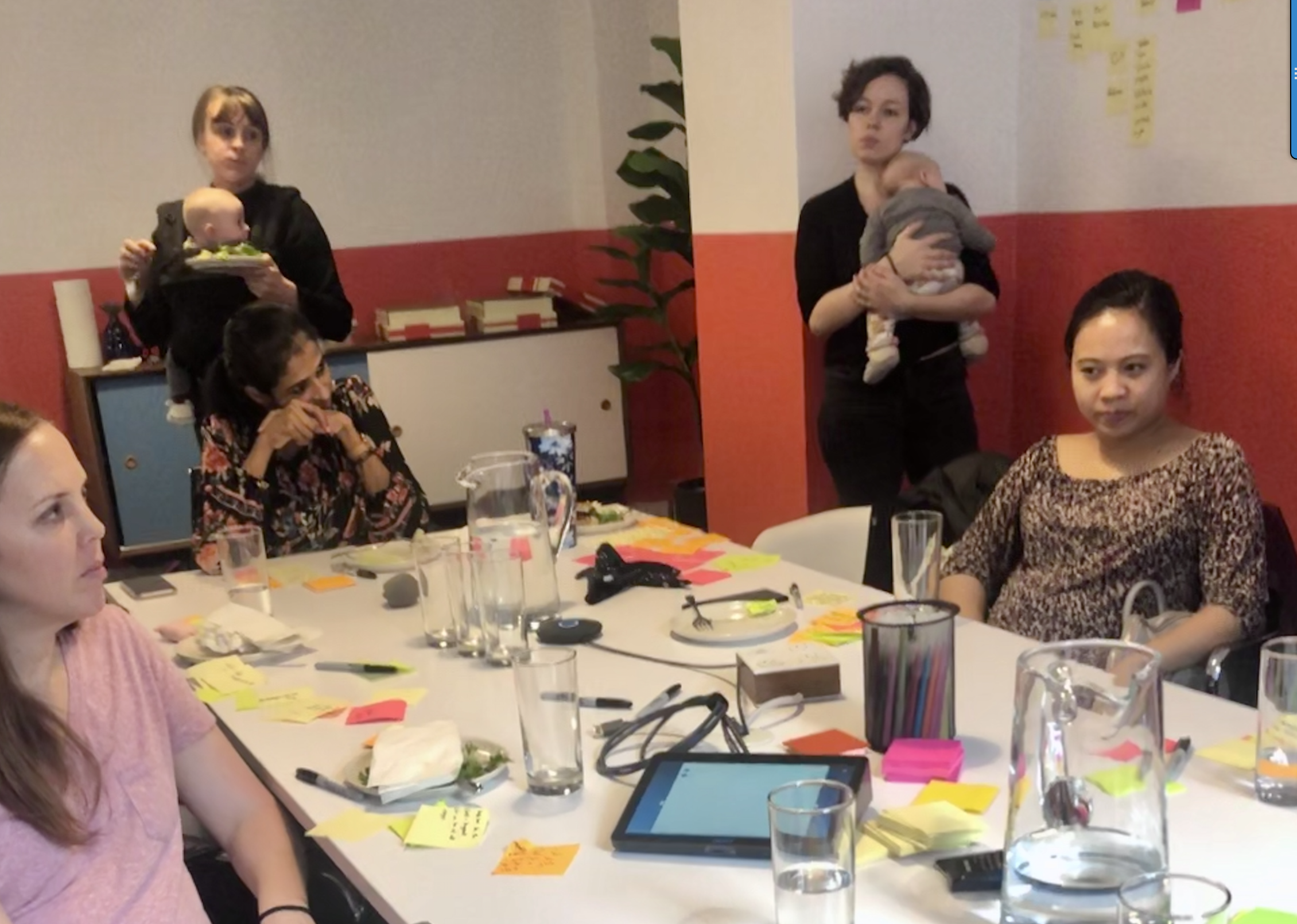
To find answers, we collaborated and brainstormed with expectant and postpartum mothers, mapping their immediate needs, future hopes, and top stressors as they prepared for life with a new baby. Key themes emerged around mutual support, longer-term financial planning, and creating enriching experiences for children. These insights, translated into HMW questions, lead to concrete artifacts that helped JennyLife see its potential as a broader support system for new parents.
Co-creation: bringing stakeholders into the process
Designing with users, not just for them, can transform a good experience into an experience that really resonates. Co-creation brings together end users and client stakeholders to collaborate on early concepts, turning rough ideas into tangible starting points for discussion and feedback. It’s not just about generating solutions—it’s about creating space for reflection, sparking conversations, and exploring “what if” scenarios that challenge assumptions.
For clients, co-creation is a powerful, interactive form of research that can help teams see the people they serve as individuals, not just segments or data points. In a field like insurance, where trust is key, this kind of hands-on empathy-building is invaluable. By engaging clients and users in the process, we not only design better experiences but also help our clients embrace the mindset needed to create lasting connections with their customers.
Case study: Co-creating with Millennials to transform the insurance experience
A few years back, we noticed that the insurance industry often talked about millennials with a bit of an eye-roll, leaning into popular avocado-toast-eating stereotypes and labeling an entire generation disengaged or uninterested. We saw this as a chance to flip the narrative, helping insurers see millennials as valued customers, and to reach them, insurers needed to meet millennials where they actually were.
To make this connection, we brought millennials into the process through co-creation workshops. In these sessions, we explored the real challenges they face—like digital fatigue, burnout, and financial stress—and together, brainstormed what a more meaningful insurance experience could look like. Core values like community, authentic connection, social good, privacy, and transparency emerged as priorities. These insights became the foundation for product concepts that didn’t just appeal to millennials but spoke their language.
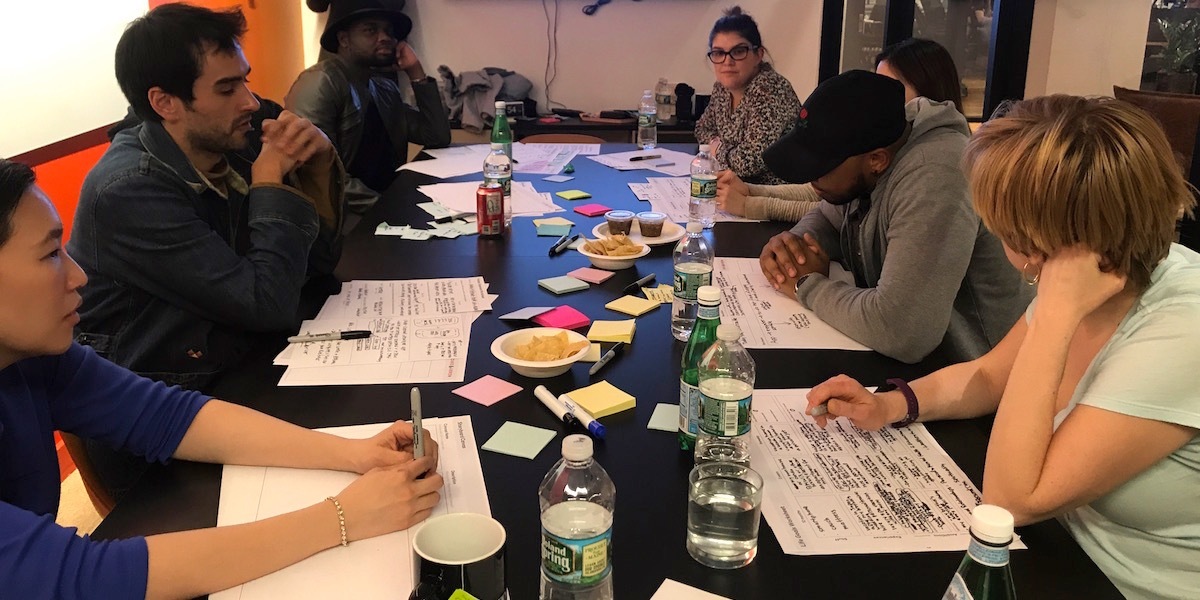
The result? An experience vision that cut down the learning curve, connected with their values, and sparked genuine engagement. This project highlighted the power of co-creation—not just for developing relevant products, but for building real connections with users that resonate beyond the screen.
Case study: Shortening the feedback loop with VoxSmart
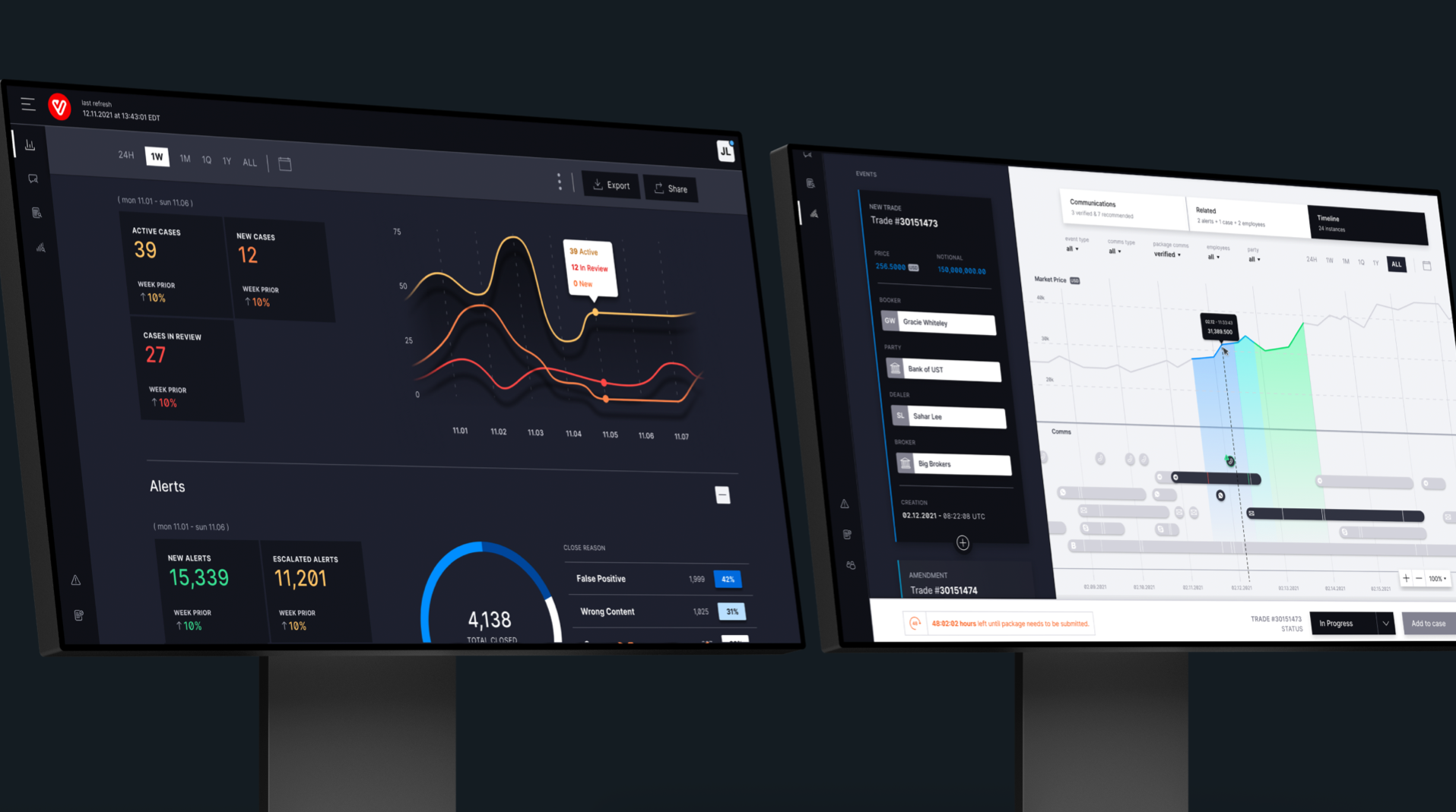
Our work with VoxSmart, a RegTech company, harnessed the power of iterative co-creation with both end users and business stakeholders. VoxSmart’s products are used by large financial institutions to ensure compliance in highly regulated environments. Working side by side with the people who would build, support, and use VoxSmart’s platform, we could quickly explore and refine features that met compliance requirements while still prioritizing usability. This balancing act revealed solutions that wouldn’t have surfaced otherwise, delivering a product that met the technical needs of VoxSmart’s clients while providing a smooth, intuitive experience for end users.
From policies to partnerships: Making insurance tangible through design
Design research bridges the gap between what insurance is and what it feels like for those who rely on it. By focusing on real users, we transform abstract concepts like “coverage” and “protection” into hands-on experiences that are clear, accessible, and human. In an industry known for its complexity, design research brings the user’s voice into every decision, making insurance feel less like paperwork and more like a trusted partner.
